

Last Updated on July 17, 2023 by Rakesh Gupta
Big Idea or Enduring Question:
- How do you use the lightning web component to display the modal window?
Objectives:
After reading this blog, you’ll be able to:
- Understand the difference between alert and modal
- Display a modal with an overlay on the button click
- Display another lightning web component inside the modal
- Hide the modal when closed by the user
- and much more
In the past, I’ve written a few articles on Lightning Web Component. Why not check them out while you are at it?!
- Add Confirmation, Alert, and Prompt Dialog Box to Lightning Web Component
- Using Lightning Web Component to Show an Alert Banner
Business Use case
Janel Parrish is working as a Junior Developer at Gurukul on Cloud (GoC). Janel got a task to design a lightning web component that has buttons with the option to open the following forms:
- Submit Lead
- Submit Address Change
- Initiate KYC

What is lightningModal?
The modal is a window that is displayed over the existing application and deactivates the functionality of the rest of the content. Modals are often used to direct users’ attention to take action or view a message from the application.
What’s the Difference between an Alert and a Modal?
An alert is a small window that generally prevents users from doing anything on a page until they’ve dismissed it.

A lightningModal component overlays a message modal on top of the current app window. A modal interrupts a user’s workflow and draws attention to the message. The difference is that modals need direct interaction to be dismissed. Modals are the best way to insert a message or a lightning web component into the application.
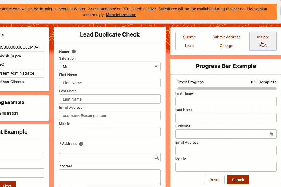
Let’s say you have a button with a call to action that says Initiate KYC, and when you click on it, a container (LWC) shows up with a list of activities that need to be triggered. It lets you do more work without showing all the work upfront.
Unlike other components, the lightningModal component doesn’t use a lightning-modal tag or extend LightningElement. There is no lightning-modal component. Instead, you create a modal by extending LightningModal and using this helper lightning-modal-* components to provide a header, footer, and the modal’s body.
- lightning-modal-body
- lightning-modal-header
- lightning-modal-footer
To create a modal component, import LightningModal from lightning/modal. The component has access to the normal LWC resources as well as the special container, helper components, methods, and events of the lightning/modal module.
Automation Champion Approach (I-do):
To solve the above business requirement, we will create lightning web components below. We will also learn how to pass lwc inside a lightningModal base component.
- baseLightningModal
- lightningModalExample
baseLightningModal Component
This modal lightning web component will use to submit a lead. We will call this modal form from lightningModalExample and pass the value to the content property.
baseLightningModal.html
The modal’s HTML template uses helper lightning-modal-* components to provide a modal’s header, footer, and body. In this example, the content for the modal body comes from the content property we defined in the modal’s JavaScript file.
The lightning-modal-header and lightning-modal-footer components are optional but recommended. The lightning-modal-* components render in the order they appear in the template. Place the lightning-modal-body component after lightning-modal-header and before the lightning-modal-footer component.
<template>
    <lightning-modal-header label={content}></lightning-modal-header>
    <lightning-modal-body>
    <form>
        <div class="slds-box slds-theme_default">
            <lightning-input
                name="firstName"
                label="First Name"
                value="">
            </lightning-input>
            <lightning-input
                name="lastName"
                label="Last Name"
                value="">
            </lightning-input>
            <lightning-input
                type="date"
                name="birthdate"
                label="Birthdate"
                value="">
            </lightning-input>
            <lightning-input
                type="email"
                name="emailAddress"
                label="Email Address"
                value="">
            </lightning-input>
            <lightning-input
                type="tel"
                name="mobile"
                label="Mobile"
                value="">
            </lightning-input>
        </div>
    </form>
    </lightning-modal-body>
    <lightning-modal-footer>
        <div class="slds-m-top_small slds-align_absolute-center">
            <lightning-button
                variant="Neutral"
                label="Cancel and close"
                class="slds-m-left_x-small"
                onclick={handleClose}>
            </lightning-button>
            <lightning-button
                variant="brand"
                class="slds-m-left_x-small"
                label="Save"
                onclick={handleSave}>
            </lightning-button>
        </div>
    </lightning-modal-footer>
</template>
baseLightningModal.js
In this example, the content property passes data to the modal from the invoking component i.e., lightningModalExample.
import { api } from 'lwc';
import LightningModal from 'lightning/modal';

export default class MyModal extends LightningModal {
    @api content;

    handleClose() {
        this.close('done');
    }

    handleSave() {
    }
}
baseLightningModal.js-meta.xml
Every component must have a configuration file. The configuration file defines the metadata values for the component, including supported targets and the design configuration for Lightning App Builder and Experience Builder.
<?xml version="1.0" encoding="UTF-8"?>
<LightningComponentBundle xmlns="http://soap.sforce.com/2006/04/metadata">
    <apiVersion>56.0</apiVersion>
    <isExposed>true</isExposed>
    <targets>
        <target>lightning__RecordPage</target>
        <target>lightning__AppPage</target>
        <target>lightning__HomePage</target>
    </targets>
</LightningComponentBundle>
lightningModalExample Component
upon the button click, it will open the baseLightningModal component. It also passes the value to the content property.
lightningModalExample.html
The HTML template for this app contains a group of buttons that opens the modal.
<template>
<div class="slds-box slds-theme_default">
<lightning-button-group>
    <lightning-button onclick={handleLead} label="Submit Lead" aria-haspopup="modal"></lightning-button>
    <lightning-button label="Submit Address Change"></lightning-button>
    <lightning-button label="Initiate KYC"></lightning-button>
</lightning-button-group>
</div>
</template>
lightningModalExample.js
LightningModal provides an .open() method that opens a modal and returns a promise that asynchronously resolves with the result of the user’s interaction with the modal. LightningModal Provides these properties
- Label
- Size
- Description
- disableClose
It invokes the .open() method in a handleClick()function bound to the app button’s onclick attribute, and uses async and await keywords to handle the promise returned by .open(). This example overrides the size value by setting it to large and sets the modal’s user-defined property content.
import { LightningElement } from 'lwc';
import myModal from 'c/baseLightningModal';

export default class MyApp extends LightningElement {
    async handleLead() {
        const result = await myModal.open({
            size: 'small',
            description: 'Accessible description of modal\'s purpose',
            content: 'Lead Generation Form',
        });
        console.log(result);
    }
}
lightningModalExample.js-meta.xml
Every component must have a configuration file. The configuration file defines the metadata values for the component, including supported targets and the design configuration for Lightning App Builder and Experience Builder.
<?xml version="1.0" encoding="UTF-8"?>
<LightningComponentBundle xmlns="http://soap.sforce.com/2006/04/metadata">
    <apiVersion>56.0</apiVersion>
    <isExposed>true</isExposed>
    <targets>
        <target>lightning__RecordPage</target>
        <target>lightning__AppPage</target>
        <target>lightning__HomePage</target>
    </targets>
</LightningComponentBundle>
Proof of Concept
Formative Assessment:
I want to hear from you!
What is one thing you learned from this post? How do you envision applying this new knowledge in the real world? Feel free to share in the comments below.


